
What is a histogram?
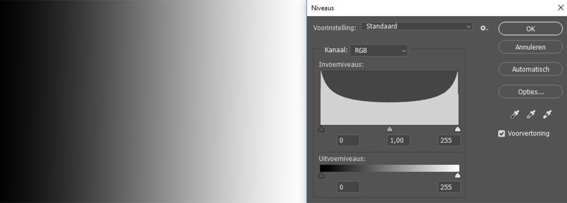
The histogram is a graph that shows how the light tones are divided across your shot. On most cameras you’ll find the histogram by pressing the info button on the LCD display. You can consult the histogram in a photo editing software package under the function levels (Dutch) or levels (English). The graph clearly shows the clarity of a pixel on a scale that ranges from completely dark to completely light.
A 8bit colour channel is used for photochemical prints. A single bit can have either a 0 or 1 value, so there are two options per bit. So, with a shot taken with a 8bit colour channel, the histogram is therefore comprised of 2x2x2x2x2x2x2x2= 256 values. These are on the x-axis, and go from 0 on the left (absolute black) to 255 on the right (absolute white). The height of the values is shown on the y-axis, this shows the number of pixels encountered at a certain degree of brightness. No entry means that the light tone in question hasn’t been “used”; all the way to the top means it’s been maximally “used”. The graph is also often divided into 4 (Nikon) or 5 (Canon) columns on the camera’s LCD display. This is meant to provide an even more legible image composition, from dark to light.
What can I use the histogram for?
Your camera’s LCD display is a great tool that helps you decide how happy you are with your chosen angle etc., but by no means is a good exposure check.This is where the histogram can help: see it as an exposure meter, one that displays more than 50 light tones with every stop. So, by keeping an eye on the histogram whilst you take your shots, you’re getting a reasonably useful exposure prediction. The histogram gives you a better idea of the shot than your camera’s LCD display. However, the histogram has its faults. Firstly, it’s based on the JPG thumbnail that is shown on your LCD display, not on the RAW file. If sections of the histogram fall outside the image on your camera (outside the x-axis), you’ll often have quite a bit left over with RAW in post-editing, which means you’ll still have (limited) details in these areas of the photo. Secondly, the same applies to the histogram as to the camera’s exposure meter; you see the average light division between light and dark tints. Whether a shot is under or over exposed is all to do with the subject and ambient conditions, of course. The way forward then is to see the histogram as a practical guide, not as set in stone.
Different forms
The histogram can be regarded as a mountain range, where the emphasis can be on the middle, left or right. The middle peak is seen as the “ideal histogram”, as the light is nicely divided: there are no extremes. An evenly spread pixel pattern though does not mean the photo is correctly exposed, only that the relationship between dark and light areas is in balance. Similarly, a peak on the right-hand side needn’t necessarily mean that a photo is over exposed, or that one on the left is under exposed. For instance, light isn’t “nicely divided” with a nocturnal shot or snowy panoramic shot at all. There will be many pixels that swing from 0 to 256, or even exceed the x-axis range, but in the condition specific to that shot, that needn’t necessarily be an issue. The examples below illustrate these three basic forms: equally divided tonal values, tonal values shifting to the left and tonal values shifting to the right.
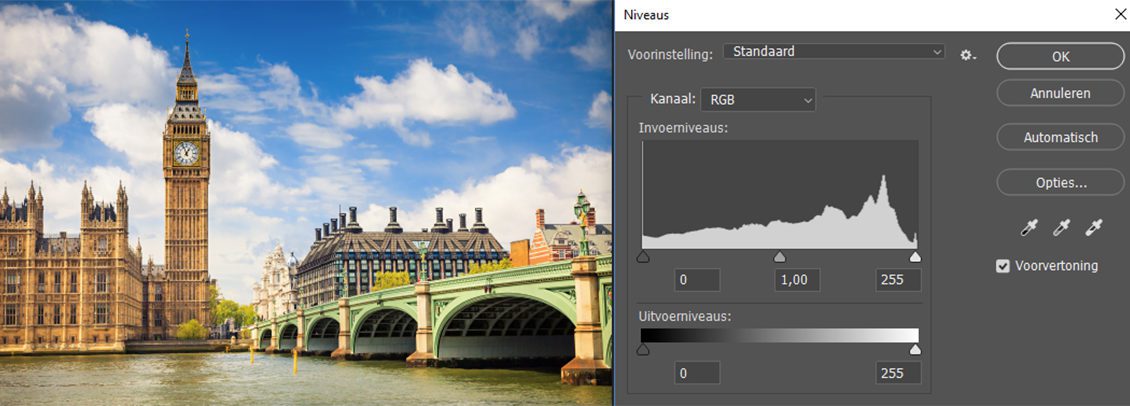
The subject and the setting comprise divergent brightnesses: tonal value distribution will be relatively equal.
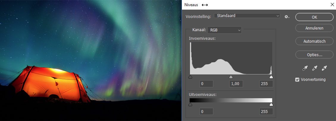
The subject and/or setting is dark: the division of tonal values shifts to the left.
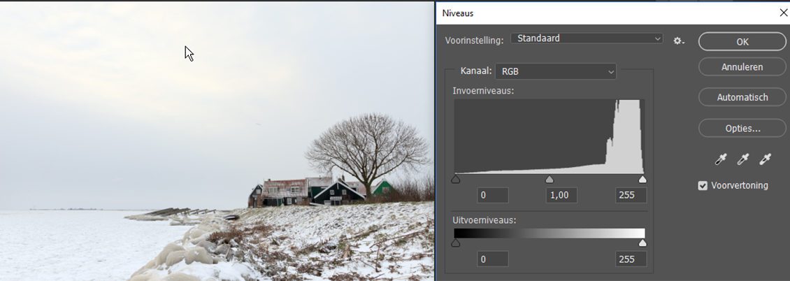
The subject and/or setting is light: the division of tonal values shifts to the right.
Does the perfect histogram exist?
No, it does not. The histogram’s form depends on the subject, the ambient conditions and the way in which you wish to capture the full picture as it were. As such, each type of shot has its own “ideal histogram”, meaning therefore no single ideal version can exist therefore. The key thing to look out for are the left and right edges (on the x-axis), which are the borders the camera can register with its sensor. As long as the values 0 and 255 aren’t reached, the subject will fall in the sensor’s range, so you won’t get any clogged up or eroded image element areas. You see, all the way to the left renders very dark noise in the saved pixels; all the way to the right renders saved pixels without image data, i.e. clipping. In terms of the shot’s exposure, it makes no difference if the graph exceeds the y-axis.
Sense and nonsense
What then is the sense and nonsense behind the histogram? A histogram in itself tells us little: you will always need the context of the image to decide if a shot is correctly exposed. If you’re well-versed in reading histograms, you’ll often see at a glance whether the shot has been properly translated in the histogram. If yes, on location you can already direct the histogram to the left or right, using exposure compensation, for example, with shorter or longer shutter speeds. During post-editing you can use the slides under the histogram for exposure compensation. The left slide determines the black point, the right the white, and the middle slide controls the brightness of the middle tones.
So, the histogram can be a really useful ancillary tool, both on location and during post-editing. But ancillary is all. Indeed, if you really want to know in precise detail what the correct on location exposure is, you are much better off using an exposure meter. And for truly meticulous analysis and potential post-editing of your shot, calibrate your monitor.


