Are you ready ….
Different printing methods can yield different results; to accurately predict the end result, several influencing factors should be taken into account. Previously, we wrote a blog about What the eye can see and what a print can reproduce, and now, as promised, we’ll delve deeper into what soft proofing entails. Good photography starts with configuring your equipment properly. This means (repeatedly) checking the white balance on your camera. Shoot away to your heart’s content, and then the ‘real’ work starts, when you want to encapsulate your image in the form of a print. Which photos are good enough for a photo book or photo print? You start collating these in a folder, ready for post-editing. To properly assess a photo on-screen you must ensure the monitor is properly calibrated. A monitor profile (as stipulated in the Dutch Institute for Digital Photography’s guideline, and such as we use) ensures we see the same colours across multiple devices. Soft proofing is a non-starter without a properly configured monitor, and photo editing too of course, if your yardstick isn’t up to scratch. Get these things sorted, and you’re ready to go!
Learning a new language
What are you actually ready for? What’s the point of soft proofing? The idea is to predict as accurately as possible what your image will look like once printed. It’s like learning a new language, so you’ll need a little practice to get it fully under your belt. For instance, a monitor emits light, which the print won’t, and the paper properties will also impact how you’ll perceive the print. To practice, we recommend you first do a spot of role reversal: before you start using soft proofing as a predictive tool, make the soft proof retrospectively the first few goes, once you have the prints in hand. Read on for some handy tips on how to compare a print with the screen .
An actual print helps you better estimate the conversion from screen to print.So, make a couple of test prints of your images and offer these up alongside the monitor, using a daylight lamp for optimal comparison. This exercise will help you develop a feel for that image conversion. Another plus point of the test prints is that you’ll know straight away which paper type enhances your photographic style, and what best suits your tastes.
Soft proofing: how does it work?
Once you’ve post-edited the photo to your liking, or if you have perfectly-shot footage already, you’re ready to soft proof it. To start with, download our colour profiles from the website and install these on your computer. Installation is relatively simple: if you use Windows, click on it with the right mouse button and select Install profile. If you use MacOS, copy the profiles to the Library/ColorSync/Profiles folder. Photoshop automatically retrieves the profiles. If Photoshop was open whilst installing the profiles, close and open it again. Via View -> Proof Setup -> Custom you’ll reach the Customise Proof condition menu. Under Device to simulate, select the colour profile in question.
With Rendering intent you have 4 options:
- Perceptual
This conversion technique embeds, as it were, all the colours in the current profile into the new profile; the interplay between the colours therefore remains the same, but they do however all shift fractionally.
- Saturation
This conversion technique is mostly used for print graphics, whereby the change in colour is important, but not the exact tint.
- Relative colorimetric
With this, the white point of the source colour space is compared with that of the target colour space, and all colours outside of it are slotted into the target profile again as it were.
- Absolute colorimetric
This conversion method is mostly used in the medical world, where exact colour rendering is absolutely essential.
For simulation of our prints always select Relative colorimetric. Using Black point compensation Tick when proofing our profiles. If preferred, in the pop-up window you can also tick simulate paper colour and/or black ink. This may or may not be advisable, depending on the medium you’re making a soft proof for. At Profotonet you can for the most part leave these options as they are, you just need to tick under Velvet. Velvet is a good example of a paper type that is extra tricky to simulate on- screen. It “drinks” colour a little, which results in a muted, vintage look&feel. So, to get a better idea with Velvet, you’ll need to tick “simulate paper colour” and “simulate black ink” in the soft proof window. If you don’t do this, black stays as deep black and the print can disappoint.
Once you’re done configuring, save the profile, giving it an easy name to remember for frequent use!
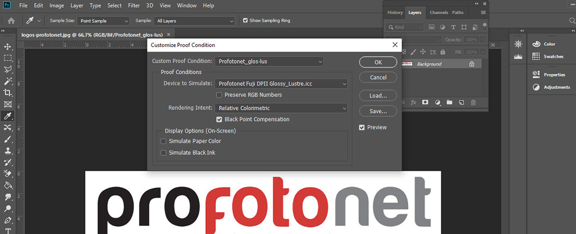
Via View -> Proof colours you can enable or disable the profile without actually converting the file, so the document will stay as, e.g. Adobe RGB or sRGB. The shortcut key to disable and enable the soft proof in Windows is: CRTL + Y, and in MacOS: CMD + Y. To see if the proof is active, behind the file name in between the brackets you’ll see “(*document colour profile*/*number of bits*/*custom soft proof colour profile name*)” respectively, so e.g., “(AdobeRGB/8/ Profotonet_glos-lus)”.
Submitting your images for printing can then proceed as usual with an Adobe RGB or sRGB colour profile. So, you needn’t convert the images for submission into our profiles, these are only intended for the monitor simulation.
Practice makes perfect
To summarise, we recommend you first make the smallest possible test print of your favourite shot, before gluing it behind Acrylic or Dibond, for example. Then, on our order platform select an individual photo print on the paper of your choice. Do first check though which paper type can be selected for the end product you have in mind. Using the individual print, you can fully assess whether the final result you have in your mind’s eye comes across as you want it to on the print, before switching over to larger formats. Don’t worry: the more you print, the better feel you’ll get about the different printing styles. You’ll soon get to the point when you can assess the paper type that’ll enhance your photographic style and subject, without the need for a soft proof or test print.Practice makes perfect; it’s a question of trial and error.
N.B.: Would you like to learn more about converting your image into a print? Read our blog entitled The histogram: sense and nonsense! Don’t forget to read What the eye can see, and what a print can show too.


