Questions? We can be reached at +31 (0) 10-2640410 until 16:30.
What wavelength are we on?
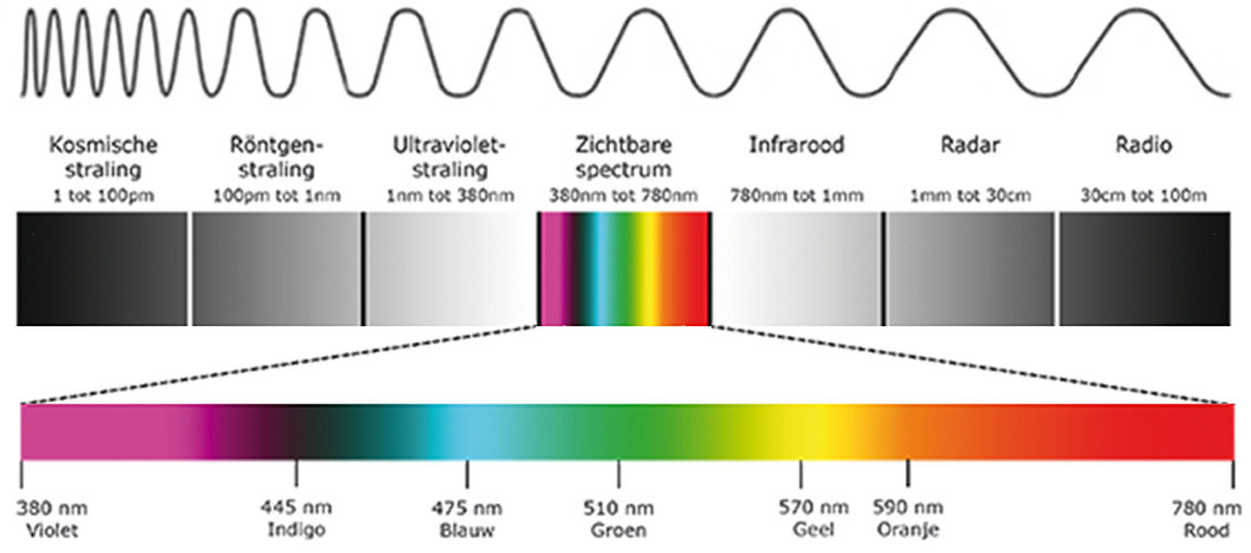
Light is a kind of electromagnetic radiation, and the visible spectrum are the wavelengths we can perceive as colour. In theory, the human eye can discern between 380 (violet) and 780 (red) nanometres. What can be reproduced on a screen or print is just a part of that.
Two colour systems are used to print a colour: the CMYK model based on four colours; Cyan, Magenta, Yellow, Key colour (usually black) and the RGB model based on three colours; Red, Green, Blue . Among other things, CMYK is used for printed matter and objects, whereas RGB is used, among others, for monitors, photo/video cameras and photo prints.
Converting radiation
To help devices convert colour, the sensor’s information has to be converted into pixels. The conversion from sensor to pixels may already occur in the camera if you’re shooting in JPG, but afterwards too on the computer if you’re shooting in RAW. The colour profile settings on your camera, or the selected RAW conversion profile, ultimately determine the image’s on-screen colour gamut. A monitor also has its own colour profile. Ideally, you should calibrate this before you analyse and post-edit photos. Calibrating to a specific colour profile ensures users see the same colours across multiple devices.
So, electromagnetic radiation is captured by the sensor when taking the shot, and is then converted into pixels in the camera or on the computer, using a colour profile.
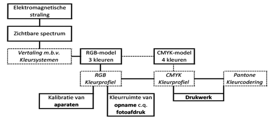
Colours are expressed in RGB on monitors and in photography. Besides referring to CMYK and Pantone colour coding, this blog will not delve into them any further. They are relevant to printed matter, but not to our lab.
Eye versus colour profile
So, when taking a shot, ideally you should already be aware of the colour profile you’re photographing in. RAW is the preferred option if you have high expectations, as here colour data retains optimal quality: in RAW the image still comprises pure sensor registration, thus giving your eye’s conversion to an image the best possible start. RAW does though take up more space, so you could opt to shoot your holiday snaps in JPG, and to only switch to RAW on very special occasions.
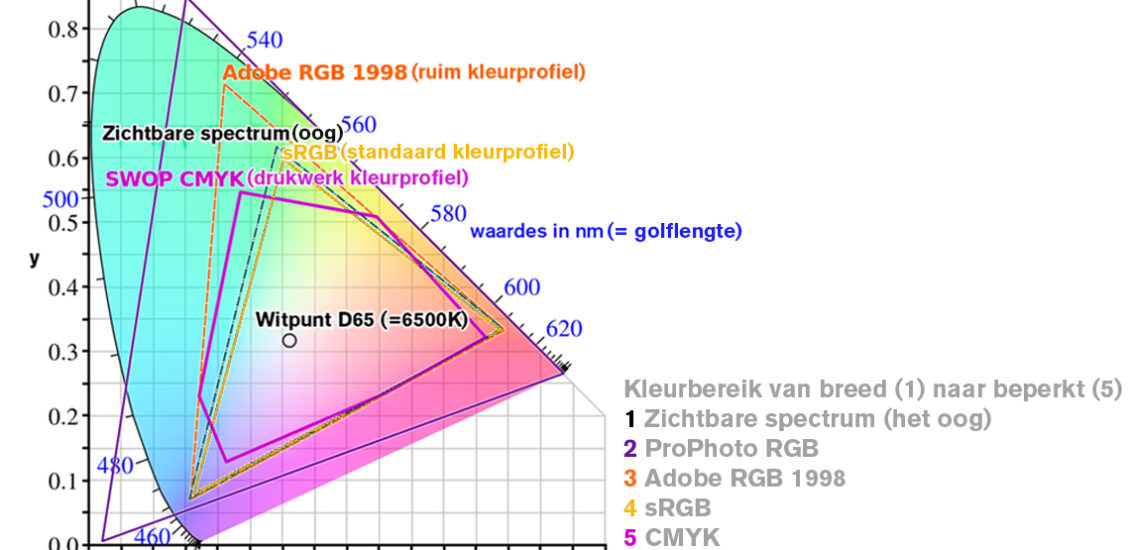
For photochemical prints you supply the image in Adobe RGB or sRGB, as usual. The broadest RGB colour profile is Profoto RGB, developed by Kodak to encompass all possible colours known to man. However, due to technical limitations this profile cannot be printed or displayed on a monitor, so is not therefore recommended for use. If you’re shooting in JPG, you’re best off using Adobe RGB, for online use you can always convert to sRGB on your computer.
The table below outlines how the eye relates to the most popularly known colour profiles.
Eye versus print
Different printing methods yield different results. To accurately predict the end result, several influencing factors should be taken into account. With photography, a good start is correct configuration of the camera’s white balance and your computer monitor’s settings. For the sake of completeness, you can also download our colour profiles from the website, to configure a soft proof. Soft proofing is where a print is simulated on the monitor, which only makes sense of course if the monitor itself is properly configured. When you soft proof the photo the results can sometimes be disappointing. Vivid colours certainly, such as bright red or bright green, can fade. You can tweak your post-editing to a certain degree, to try and get the end result close to the ambience you wish to convey, but sometimes a particular colour is unattainable. You could then decide whether you still wish to print the image, or otherwise select a different photo for large-scale display on the wall.
Simulating the effect of the different paper surfaces remains somewhat tricky; a screen renders light but not paper … It’s all about grasping what you actually see on-screen and how that converts into a print.
Can you calibrate your eyes?
Over and above the colour limitations, a crucial factor is your own perception and taste. Not every eye reads colour in the same way. Eyes can be tested but not calibrated. And that’s not a bad thing either, as this means we see the beauty in different things. Key is that you know what to expect when you have your images printed. If you are able to impart your own taste and style onto photo paper, your image will truly come to life.
With a stunning wall print , or a photo book on a coffee table, we can continue to surprise one another with our take on things; keeping the world around us a vibrant and diverse place. So, keep your eyes peeled and capture those rays!


